It’s been a while since I talked about Parents Need to Eat Too, probably because I’ve been so busy coming up with recipes, coordinating recipe testing with my amazing (and huge) crew of mom-testers, and, y’know, writing it. But this week I’m finally starting to believe this is real (I know, it’s been real for nearly a year—it just hadn’t felt that way). See, on Wednesday my agents and I went to HarperCollins to have our first official marketing discussion about the book. We sat around the table with my fabulous, amazing, insightful editor, her boss (the VP of creative development), the associate publisher, a publicity bigwig, and two marketing people, and talked about nothing but me and my book.
This was a bit bizarre for me—before I left corporate life in 2002, I was on the other side of the table. I used to be an advertising & promotion person for a different, equally humongous, publisher, and in these meetings it was my job to guide the author to an understanding of what was a smart, effective way to promote an upcoming book. It was absolutely surreal for me to be the focus of the discussion like this. I kept wanting to turn to the author and say, “Well, we’ve found that…” Except the author was me, and of course everything I want to do to promote the book makes perfect sense. Uh huh.
That prior experience came in handy: I learned long ago that it’s always wise to bribe your publisher with food. Thanks to a tray of The Best Homemade Chocolate Chip Cookies in the Entire World, I’m pretty sure Harper’s decided to triple the marketing budget. No, quadruple it.
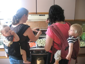
We talked quite a bit about the book’s audience and the best ways to reach them, and as you might imagine I had quite a lot to say about that. I was a little more uncertain, though, when discussion turned to the cover and what should be on it. My taste is clean, modern, simple, and it’s all too easy for that to turn out plain old boring. Plus it’s important to me that the book looks accessible—I know you can feed yourself and care for a new baby without a trip to the loony bin, and the cover should make that promise. When it comes to Parents Need to Eat Too, the cooking class, many people have responded to this picture, which I took during a class:

This photo itself wouldn’t work, but would a re-done version, with just one mom & one baby, not standing near the stove? And should it be a photograph or an illustration? Personally, I loathe cutesy illustrations on books for moms. Why do they assume we need cartoons to understand what a book is about, just because we’ve had babies? Of course there are illustrators out there who aren’t cutesy…
I’m not sure if I’m navel-gazing here, so I thought I’d turn to you for help. What are some of your favorite book covers, either of cookbooks (especially family-oriented ones) or parenting books? Harper’s asked me to send a list, and I’m sure I’m missing some good ones. So please, take a look at your bookshelf and let me know what you like!
Thanks eversomuch.
